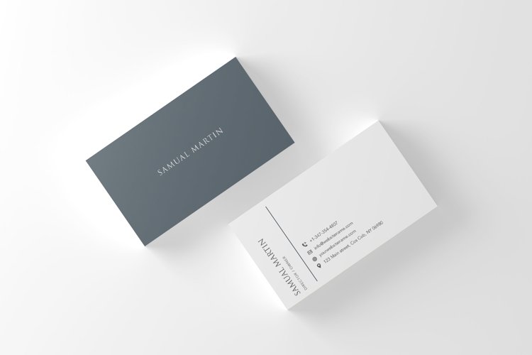
In today’s highly digital world, where LinkedIn connections and email signatures dominate professional exchanges, the humble business card continues to hold its own. There’s something personal, tangible, and lasting about a physical card that an online exchange can’t always replicate. But a business card is more than just a piece of paper with your contact details—its design can have a profound psychological impact on how you’re perceived. Understanding the psychology behind business card design can help you make strategic decisions that enhance your personal brand and leave a lasting impression.
The Power of First Impressions
We’ve all heard the saying, “You never get a second chance to make a first impression.” Business cards are often the very first tangible representation of your brand that a potential client, colleague, or business partner will encounter. The design of your card—its colors, fonts, layout, and materials—can influence how people perceive your professionalism, attention to detail, and creativity.
From a psychological standpoint, our brains are wired to make quick judgments based on visual information. In fact, studies have shown that people form an opinion about someone in just milliseconds of meeting them. A well-designed business card can harness this natural cognitive bias, presenting you as competent, polished, and memorable. Conversely, a cluttered or poorly designed card might convey carelessness or lack of professionalism.
Color and Emotion
Colors play a crucial role in business card design. They evoke emotions and associations that can impact how someone feels about your brand. For instance, blue is often linked with trust, professionalism, and calm, which makes it a popular choice for law firms, financial institutions, and other industries where reliability is key. Red, on the other hand, can signify energy, passion, or urgency, making it ideal for creative professionals, marketers, and industries that thrive on boldness.
Neutral colors like black, white, and gray convey sophistication, elegance, and formality, while vibrant colors like orange or yellow are linked to creativity, warmth, and optimism. The psychology of color is deeply ingrained in human perception, so it’s important to choose a palette that aligns with your brand’s personality and the message you want to convey.
Typography and Readability
Typography can communicate just as much as the words themselves. The choice of font style, size, and spacing all contribute to the overall feel of the card. A minimalist, sans-serif font like Helvetica communicates modernity, simplicity, and cleanliness, while serif fonts like Times New Roman are seen as more traditional, formal, and trustworthy.
But beyond aesthetics, legibility is key. If your business card is difficult to read because of overly ornate fonts or poor contrast between the text and background, the psychological effect is frustration, leading to a negative association with your brand. To avoid this, always ensure that the text on your card is clear, readable, and spaced appropriately.
Texture and Material
The tactile quality of your business card can leave a strong psychological impact. A heavier cardstock, for instance, signals a higher level of professionalism and seriousness. When people feel a thicker, more substantial card, they may subconsciously associate it with quality and reliability. Conversely, a flimsy card can come across as cheap and forgettable, even if the design is visually appealing.
Innovative materials and textures, like embossed lettering, metallic finishes, or even unconventional materials such as wood or plastic, can make a card stand out. These tactile elements create a sensory experience that can make your business card—and by extension, you—more memorable.
Personalization and Connection
Personalization plays a critical role in networking. While standard business cards might convey essential information, personalized business cards take it a step further by reflecting your unique brand identity. Whether through a custom logo, tagline, or even a photo, personalized touches help to forge a connection between you and the recipient. Personalization can make a card feel more authentic and thoughtful, reinforcing the psychological bond that’s crucial in business relationships.
Minimalism vs. Maximalism: Finding Balance
A well-designed business card should balance the right amount of information with a clean, organized layout. While it’s tempting to include every possible contact detail, too much information can overwhelm the recipient. This cognitive overload reduces the chances that they’ll remember or retain the most important details.
- MORE READ ABOUT:
Cash Flow Management 101: Key Strategies Every SME Should Know
On the other hand, a minimalist design—one with ample white space, selective use of text, and a focused design—gives your business card a clean and professional look. The psychology behind this approach is simple: less clutter equals less mental strain for the viewer, allowing them to focus on what’s most important.
However, maximalism, which embraces bold designs and complex patterns, can work well for creative industries where standing out is essential. The key is knowing your audience and striking a balance between aesthetics and functionality.
Conclusion: Crafting a Memorable Card
In an era where digital connections are often fleeting, a well-designed business card remains a powerful tool for leaving a lasting impression. The psychology behind business card design—whether it’s the colors, typography, or textures—plays a crucial role in how you’re perceived by others. By paying attention to these elements, you can ensure that your card doesn’t just end up in a drawer, but remains a memorable representation of your personal brand.
With the right balance of aesthetics and functionality, personalized business cards can help bridge the gap between digital and physical networking, enhancing both personal and professional connections.


